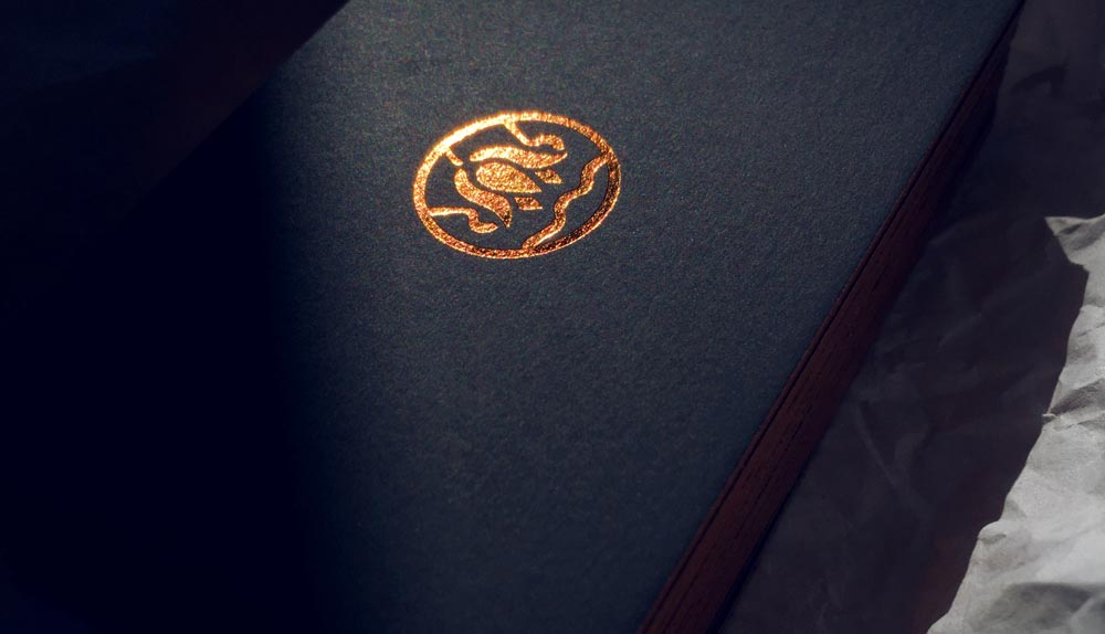
This rebranding project was crafted for Royal Retreat, a small company offering premium spa services, aiming to elevate its identity with a luxurious and rejuvenating aesthetic. At the core of the design is a striking logo featuring an abstract representation of the lotus flower, a symbol of rejuvenation deeply rooted in ancient Egyptian culture, perfectly aligning with the spa’s mission of renewal and wellness. The logo’s curvy lines introduce a fluid, liquid-like quality to the composition, evoking a sense of calm and serenity, while cleverly forming the letter ‘R’ on both sides of the lotus, tying the design to the company’s name.
Our goal was to create a strong, memorable symbol that radiates euphoria, elegance, and glamor, reflecting the high-end experience the Royal Retreat spa provides. To bring this vision to life in tangible form, the business cards were produced in two sophisticated variations: a light pink version with an embossed logo for a soft, tactile elegance, and a premium black version featuring a gold foil logo for a bold, opulent statement. Together, these elements create a cohesive and luxurious brand identity that invites clients into a world of relaxation and refined beauty.